


timeline
Sep 2025-Apr 2026 (anticipated)
role
Sole Product Designer
team
1 Product Designer, 1 Project Manager, 1 Tech Lead, 7 Developers
tools
Figma, Miro, User Interviews, ChatGPT, Twilio/SMS API Research
Problem
The Houston Air Alliance had a static, informational website with crucial air quality data, but user traffic was critically low. Our discovery revealed a dangerous disconnect: the people who needed this data most—those with respiratory conditions, the elderly, parents of young children—were not proactively visiting the site. The alliance lacked any direct channel to inform them. Our mission was not to redesign a website, but to design and launch an entirely new proactive communication product that would drive engagement and fulfill their core mission of public protection.
Solution
We will redesign the air quality dashboard to display intuitive, color-coded risk levels and localized data that immediately communicates health impacts to vulnerable populations. The new platform will prominently feature a streamlined SMS sign-up system, enabling users to receive real-time air quality alerts and safety recommendations directly to their phones.
ship date
April 2026
role
Sole Product Designer
client
Houston Air Alliance
tools
Figma, Miro, User Interviews, ChatGPT, Twilio/SMS API Research
Research
A vital resource was being ignored, putting vulnerable populations at risk.
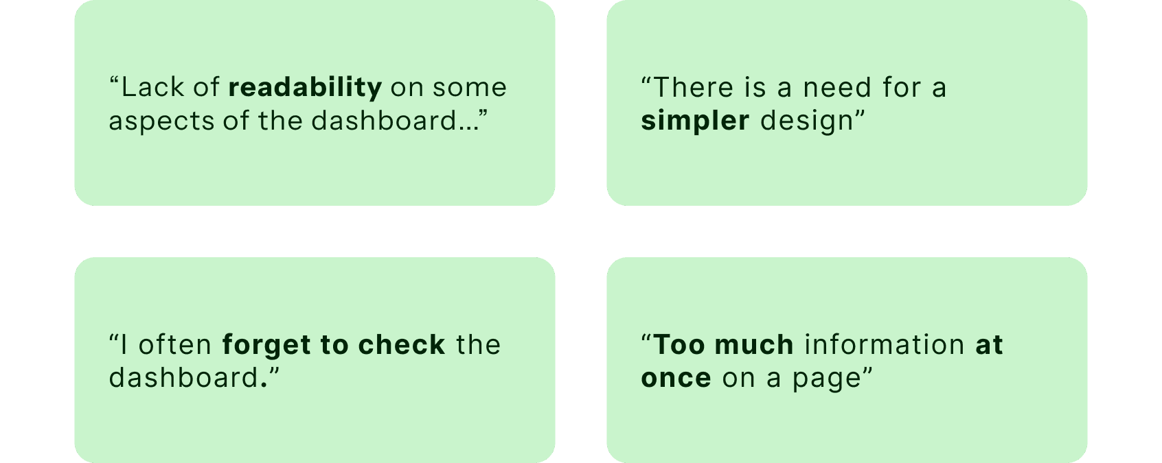
The air quality dashboard redesign began with user feedback, which surveyed typical site users over the course of 3 months, indicating that the dashboard was not accessible enough and lacked sufficient engagement. This trend was evidenced by low amounts of website visits. We meticulously analyzed the pain points faced by site visitors, conducting in-depth market research and engaging with the community to understand their needs.
Understand
Mapping out User Navigation
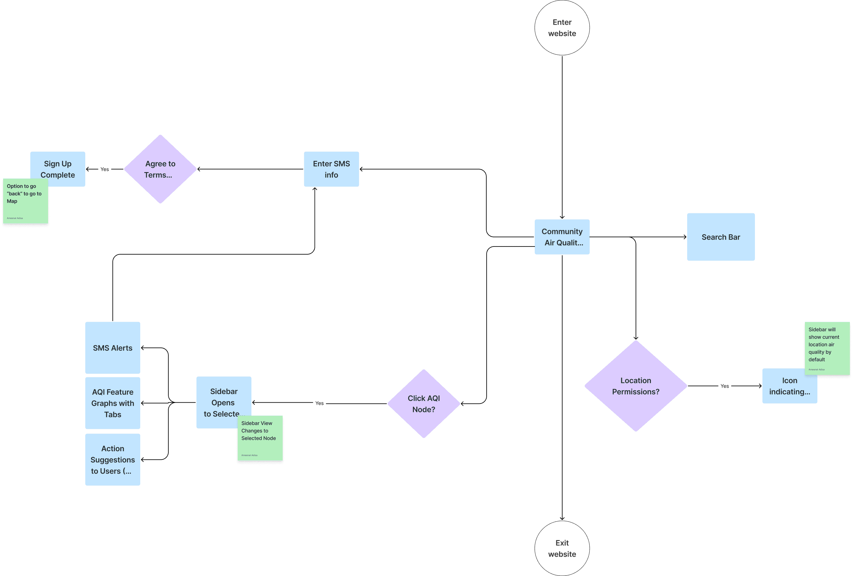
Since users struggled with the dashboard homepage, a complete redesign was necessary to improve the user experience and yield the most results. Therefore, a flow chart was drafted to analyze the best way to provide information to users without overloading them with information, unlike the previous model.
Low-Fidelity Wireframes and Mid-Fi
Armed with this knowledge, we set out to redesign a dashboard that would encourage the site to be revisited by providing the option to sign up for SMS message notifications upon entering the dashboard.
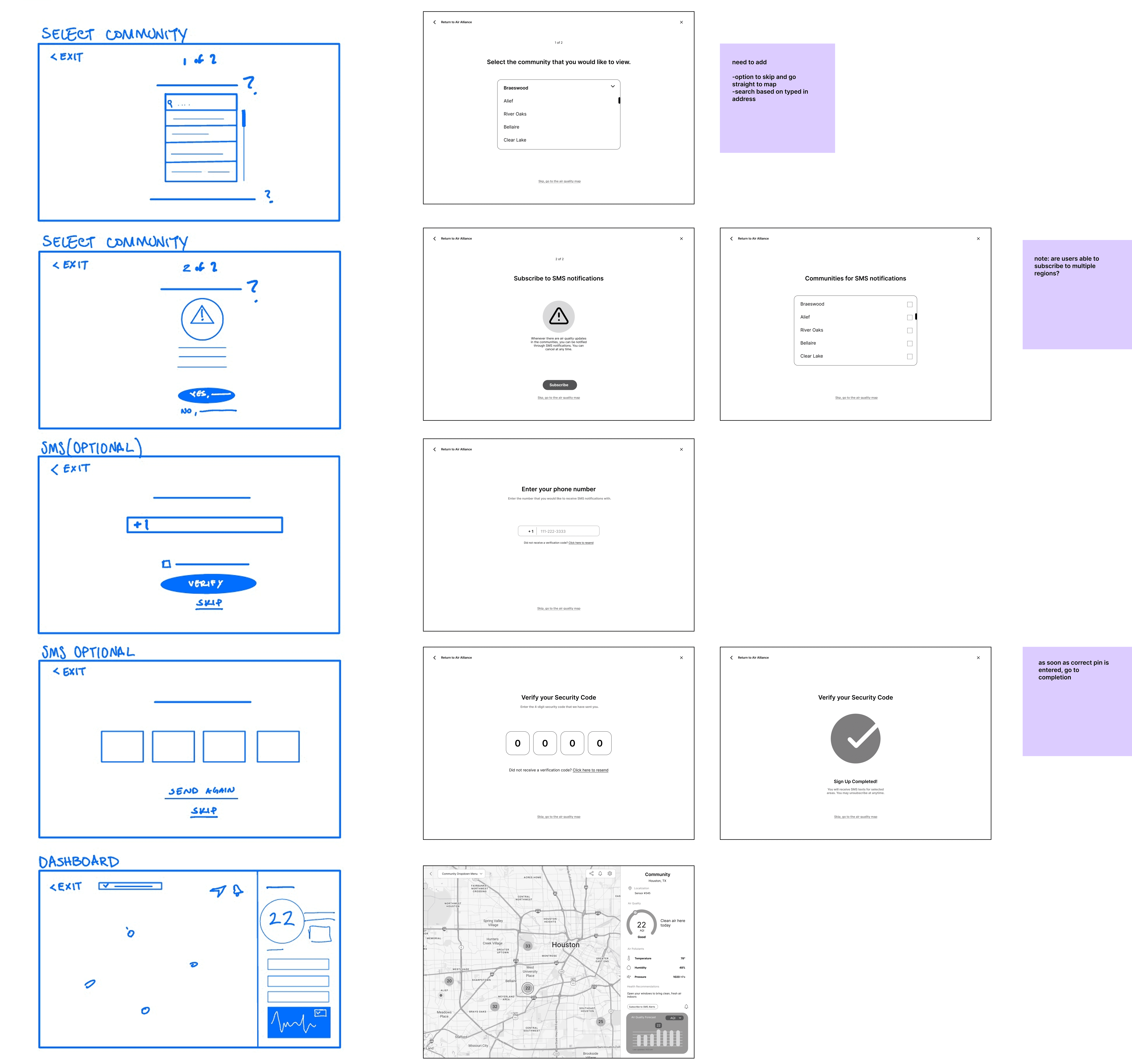
Throughout the development process, the team worked tirelessly to ensure that Air Alliance's new dashboard catered to the unique requirements of site visitors.
Specify
Narrowing down the Design Solutions
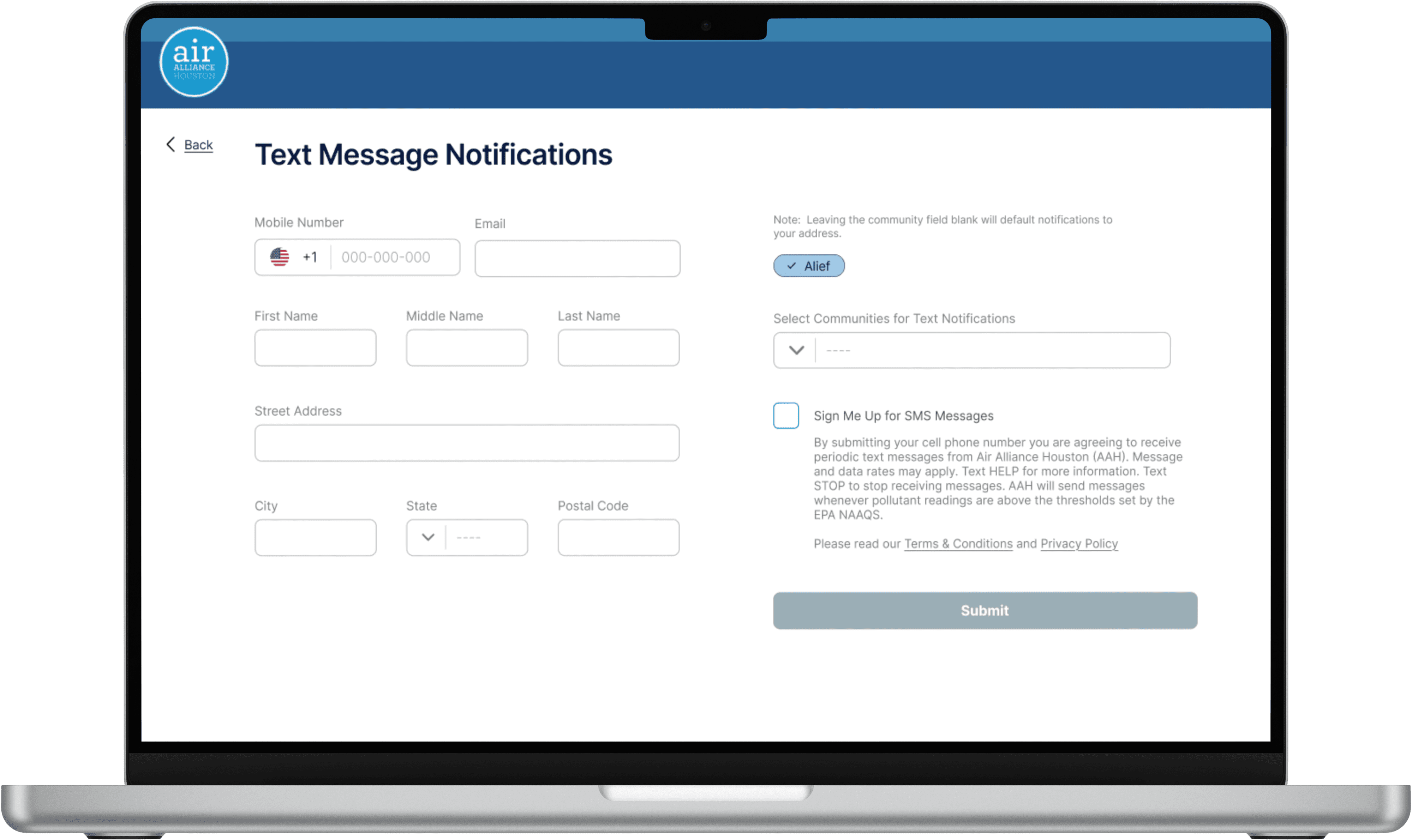
SMS Sign Up Page
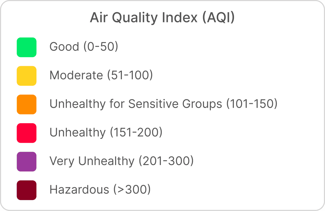
Color modification for Users
Improving the contrast between labels and background colors has allowed for improved readability and accessibility throughout the dashboard, including the map contrasts and community label sizing.
Design
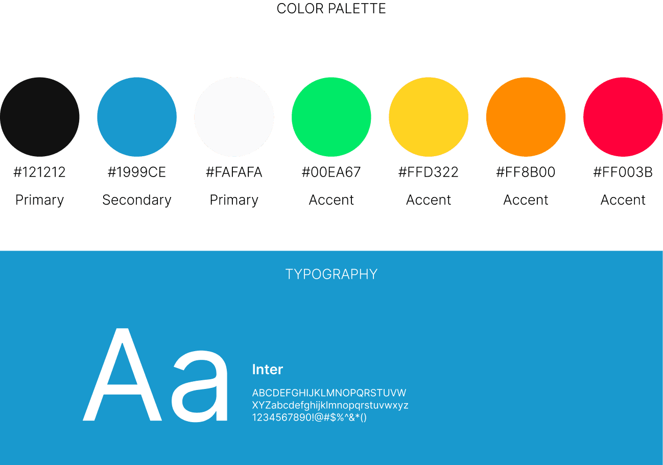
Visual Identity
Project Takeaways
What I Would Do Differently
Learned how to effectively communicate design choices and ideas to successfully collaborate with a team from start to finish, however, I would make sure to visually map out the connections from the solution brainstorming earlier on in the process.
Gathered both quantitative and qualitative research in the early design stages, setting a proper foundation for meeting user needs; however would next time prepare earlier on to gather users to survey, during the ideate phase.
Although the start of the project had difficulties conveying our ideas to one another, as more information was gathered, we were able to smooth out our communication system, and progress effectively.
01


